This is the character that i had created for the game cover "Armoured Tiger".
I made the image dark even though the image itself seems a little too dainty. This is because the tiger in the image is the tiger you start off with in the game. This is because in the game you start off as the character in an earlier part of it's life.
Plans that I have, say, for example, are just for the story line of the game. But There will be ore than one outcome.
In my design process I chose for a machanical tiger but I was struggling to make it look realistic as a machanical tiger. So that inspired me to do an armoured tiger.
I chose for it to be a dark theme because it is a game about an amoured tiger, that attacks humans. There isn't really much about that that is cute and fluffy and I wanted to keep this game as real as I guessed it would be in said situation.
This is the character in the the cover that I have designed for the console "Xbox".
This is a concept image of the Fox (main character) from the game title ' MIGHTY FOX'.
The way that I have chosen my idea for a game cover was a class exercise.
Every student in the room where to come up with two word out random off the top of their heads and they would be added to lists, the two lists were of adjectives and nouns for us to pick two words from the list and create two characters with them. I chose Machanical tiger and Mighty fox.
These four words led for me to create two characters. On called Armoured Tiger and Mighty fox.
The reason I changed the name of the tiger image was because I had already started maki9ng images on photoshop but found that it looked a lot more like it was armoured than it was Machanical so I changed it and made it fit the story line of everything in that word being Aroured because of it's nature.
This game is about a fox that saves a character in the beggining of the story and inspires him to help other people. As much as he tries humans find him to be a menace.
The aims of this game is to follow missions and to not be seen by humans during the day otherwise you'll be impounded.
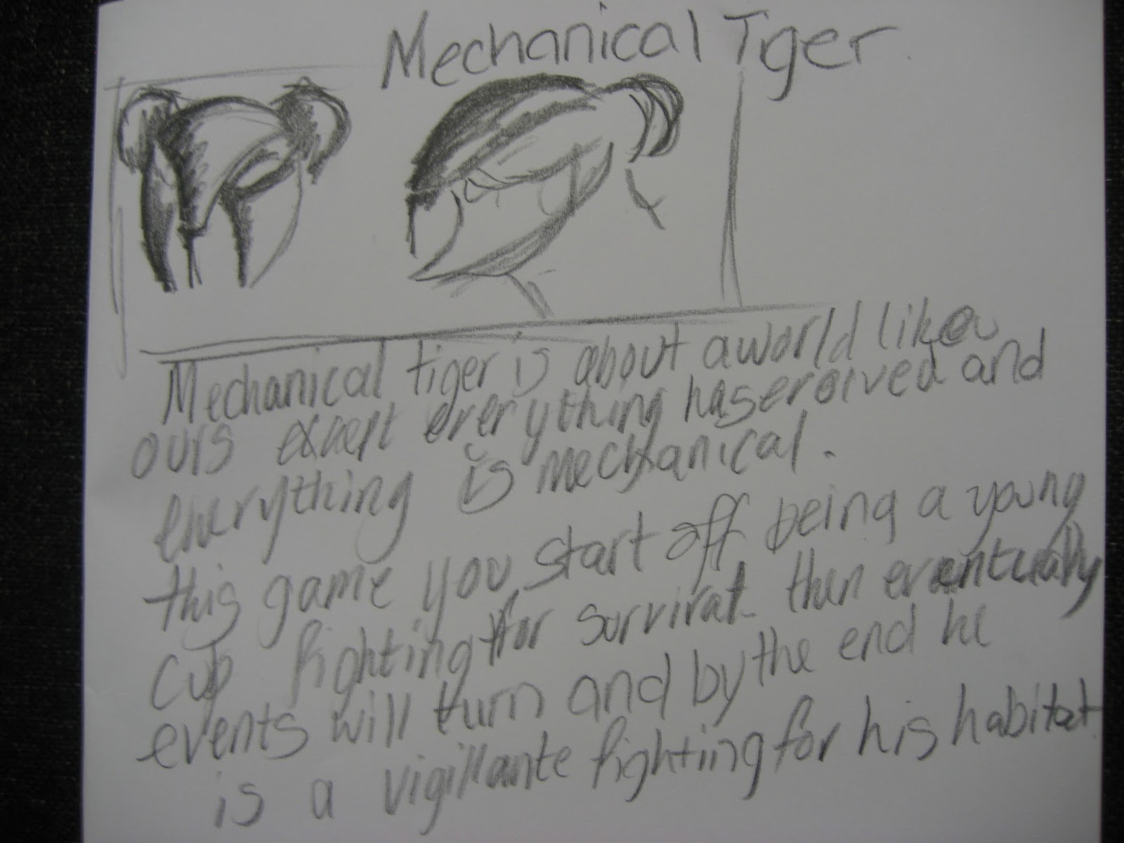
Machanacal tiger is about a world like ours except they have a lot less resources to survive with than our world so the enviornment there is a lot more violent and hostile.So pretty much the natural enviornement of this world is buildings, buildings, buildings.
This game is a pretty violent game and I intend it o be. Because in the real world there is nothing sweet and cuddly about a tiger trying to protect it's self.
The designs that I have so far is a X-box game cover that is yet to be completed. I chose X-box for this game because the console is renound for it's RPG, FPS and fighter games.
I went for a more surrealist design for the game characters but the story-line is something this world that we are in now, the real world, Can very well relate to. Because there are so many charities that appeal for this sort of thing. But in the world that I have created, it is a dog eat dog world.
The way that I have chosen my idea for a game cover was a class exercise.
Every student in the room where to come up with two word out random off
the top of their heads and they would be added to lists, the two lists
were of adjectives and nouns for us to pick two words from the list and
create two characters with them. I chose Machanical tiger and Mighty
fox.
These four words led for me to create two characters. On called Armoured Tiger and Mighty fox.
The reason I changed the name of the tiger image was because I had
already started maki9ng images on photoshop but found that it looked a
lot more like it was armoured than it was Machanical so I changed it and
made it fit the story line of everything in that word being Aroured
because of it's nature.
This is the mind map of our ideas generation when we were coming up for a poster idea for the Renault Twizzy car.
This is the final image representing The Olympics in America.
I typed America into Google and it came up with all of these images so I desided upon this decition. I'll somehow involve the flag into the actual logo.
By doing this I made the blue ring the blue section of the flag and the red and white section the red ring of the logo.
I typed in american eagle and one image of an eagle made to look like the american flag caught my eye. So I made my own version of the eagle to put on my logo design.
And since it had the olympics logo I thought it would be very obvious what the image is suppose to represent.
OLYMPICS VIDEO PRESENTATION
This video is a combinations of the concepts made my Me, Salina, Jordan and Dan.
A web banner or banner ad is a form of advertising on the World Wide Web delivered by an ad server. This form of online advertising entails embedding an advertisement into a web page. It is intended to attract traffic to a website by linking to the website of the advertiser. The advertisement is constructed from an image (GIF, Flash, often employing animation, sound, or video to maximize presence. Images are usually in a high-aspect ratio shape (i.e. either wide and short, or tall and narrow) hence the reference to banners. These images are usually placed on web pages that have interesting content, such as a newspaper article or an opinion piece. Affiliates earn money usually on a CPC (cost per click) basis. For every unique user click on the ad, the affiliate earns money.
Web banners function the same way as traditional advertisements are intended to function: notifying consumers of the product or service and presenting reasons why the consumer should choose the product in question, although web banners differ in that the results for advertisement campaigns may be monitored real-time and may be targeted to the viewer's interests. Behavior is often tracked through the use of a click tag.
Many web surfers regard these advertisements as highly annoying because they distract from a web page's actual content or waste bandwidth. Without attracting attention it would provide no revenue for the advertiser or for the content provider.) Newer web browsers often include options to disable pop-ups or block images from selected websites. Another way of avoiding banners is to use a proxy server that blocks them, such as Privoxy. Web browsers may also have extensions available which block banners, for example Adblock Plus for Mozilla Firefox, or AdThwart for Google Chrome and ie7pro for Internet Explorer.
The standard web banner sizes.
Many of these Banners or pop-ups are sponsored by web-sites so that even the web-site user can make their own with a small fee agreed by said web-site.
A common one that many people see is on the social networking site, Facebook.
See to the right it says to create an advert.
I like this type of advertising because I think it is somewhat productive as people sometimes have no choice but to use social networking sites and that they have to also constantly see these banners. Not necessarily the things that do get advertised on this that I like. But the idea of putting at the side of a news feed that is constantly watched by about a million or maybe more people at one time.
So I like it in the sense that it is kinda successful, but I don't like that they don't show things that could be used to potential.
I chose to write about amazon and the adverts that are on this website because I think it's a good source for the adverts to be seen because they are for products that people may see often and buy them. Just because the advert is there. Unlike the Facebook advertisement that I found, this website puts useful adverts up and I think that they are productive and put in a useful place.
I chose this poster because it is an effective way of raising awareness for the effects of drinking and driving. It's a pretty good pun and using the face of an alcoholic beverage to remind readers of a certain magazine with this poster in that drinking and driving is not a good idea. It is also humourous as there is a pun in the name of the person that is on the poster. I think this is a good way to raise awareness and to put it in a magazine as a poster because lots of people will read it and find it funny. They may also see the serious side to this image and realise that this image is trying to depict.
The logo for this drink is this guy that is in the wheel chair, is actually walking. I think that this is trying to portray that he used to walk with the would walked it's a past tense word and it is trying to say he used to walk until he may have been irresponsible in the story of this poster though, not literally.
This is the original image. And you can see how all the elements of this poster was taken to create some serious humour in the image above. I think the only difference is that the original is black and the guy in the wheel chair is originally walking.. I think that the parody image is red to portray that drinking and driving is dangerous. And red is danger.
I like these images because in some circumstances they can be so true to what people feel about their jobs.
I think they are quite funny too and maybe that is why they are so effective in making people aware of the situation that they are trying to show.
I have no idea what the producers of these adverts are. But I think I know what they are trying to say. I think it's quite clever in how they have shown these images.
Costa coffee advert.
I've chosen this advert because it's clever how they portray what they are trying to say in a way that brings about humour.

 This is the character in the the cover that I have designed for the console "Xbox".


